Blog
How to create content download emails that engage, delight, and convert

Summary - Master the art of engaging content download emails with Knak's guide: UX design, visual hierarchy, and CTAs that boost conversions and engagement.
Offering a piece of content such as a PDF, infographic, or whitepaper in exchange for an email address is one of the most reliable digital marketing strategies in our modern toolkit. Even if you wade into the debate between gated vs ungated content, you’ll notice that nobody is debating whether content converts.
It does.
82% of marketers actively use content marketing (source: HubSpot), which begs the question, what are the other 18% doing?
One aspect of content download campaigns that often get overlooked are the emails supporting your marketing efforts. Have you ever wondered about the design of the email autoresponder when you gate content behind a form? What about the design of the email being sent to existing subscribers?
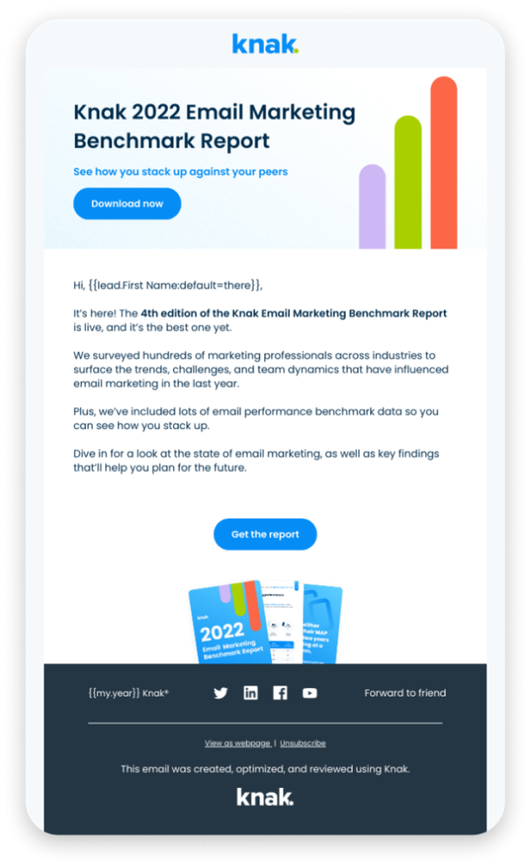
In our Email Gallery, we assembled a collection of Content Download Email Examples from top brands to understand what makes those emails so great. No doubt about it: the best emails focus on delivering value.
In this post, we’re going to take a look at how to create great emails for your content download campaigns.
Ready? Let’s go.
Creating emails for your content download campaign
What exactly is a content download email? In our context, we’re referring to any email that our audience may encounter during the course of a content campaign. It could be a series of emails spanning weeks or months, or even a simple automated email containing the content download link for the user.
But here’s the thing: the content campaign experience begins way before you hit that send button. It starts with crafting the content, designing landing pages, and mapping out your email workflows. Unfortunately, it’s all too easy to overlook the importance of the emails that support your campaign, resulting in plain text emails that do little justice to your otherwise brilliant content.
Let’s break that cycle.
While your content campaign may include various promotional emails, let’s focus on the trusty autoresponder email that goes out after a user requests your content. This email is far from an afterthought – it serves as the very first touchpoint with your new contact.
Now, let’s delve into how to make that initial impression count.
Designing effective content download emails
To create impactful content download emails, it’s crucial to focus on understanding your audience and applying user experience (UX) design strategies. By following a checklist or template informed by UX principles, you can consistently craft exceptional content download emails.
The key elements to consider when designing a content download email:
- Understanding the User
- Clear and Concise Messaging
- Visual Hierarchy
- Mobile-Friendly Design
- Clear Call-to-Action (CTA)
- Consistent Branding
- Testing and Optimization
- Analyze User Behavior
Understanding the User
Every design decision should revolve around your audience. Fine-tune your content to their needs, preferences, and pain points, ensuring a tailored experience that resonates with them. This understanding allows you to find the right tone and voice that engages your audience effectively.
Clear and Concise Messaging
Use your emails to reinforce the value and benefits of the content download using clear, concise language. Let the content speak for itself. The best way to accomplish this is using a strong headline, subheadings, and even bullet points to convey key details about the content.

Visual Hierarchy
Establishing a visual hierarchy in your email is a best practice to ensure readability and engagement with your content. Highlight important information with visual call-outs such as buttons, bold text, and lists. Use visual cues like size, color, and placement to create an orderly, easy to digest email.
While most content download emails use a single-column layout, you may opt to use a different email design approach. Here’s a quick overview of design approaches you could use in your content download email.
S-curve design
Utilize a visual “S” pattern in your email design, placing critical information and calls-to-action at the top and bottom of the curve.
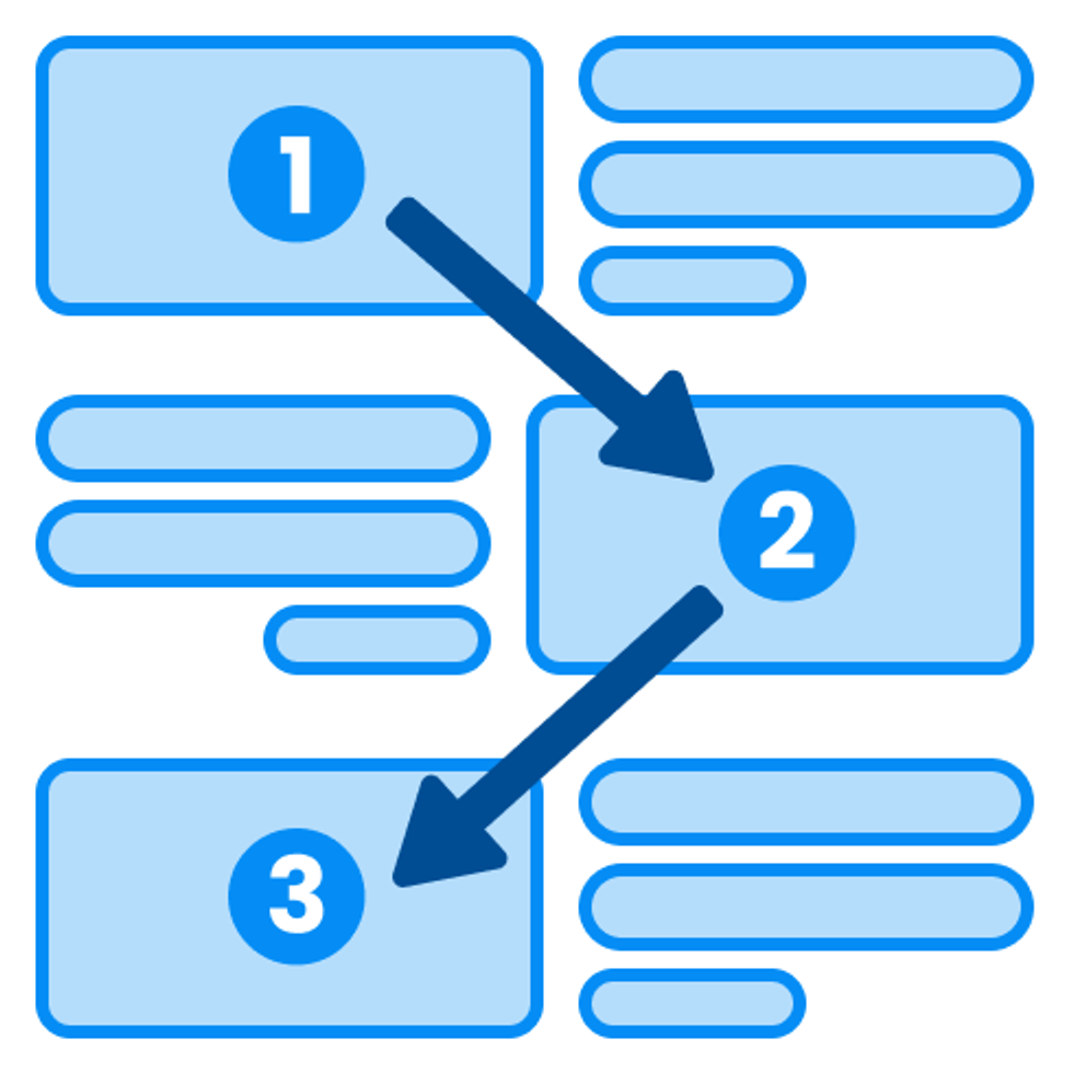
Z-pattern design

Create a visual “Z” pattern, starting with a main header at the top left, diagonally arranging content across the page, and ending with a CTA.
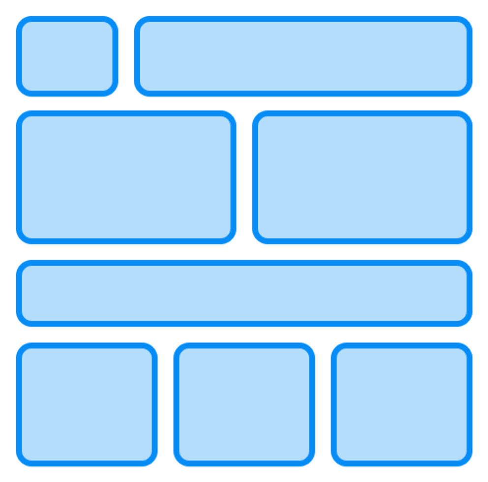
Grid-based design

Employ a grid of columns and rows to present content in a flexible and balanced manner.
Single-column design

Stick to a classic single-column layout, which is familiar and easy to navigate for readers.
Magazine-style design
Design your email layout to resemble a magazine or newspaper, incorporating multiple columns, headlines, and images.
Interactive design

Introduce interactive elements like buttons, sliders, and animations to create engaging and immersive email experiences. Monitor load time and deliverability.
Mobile-Friendly Design
In 2023, it’s almost table stakes that your emails should be mobile-friendly. It’s important to accommodate all users for accessibility reasons, and it’s smart to use responsive design techniques to ensure a seamless brand experience across devices.
Think how often you’ll review an email on your desktop and go back to it on your phone? Perhaps the best principle to follow is conciseness (our previous point) and having a clear, prominent call-to-action (CTA) (our next point).
Clear Call-to-Action (CTA)
The user has just submitted a request to receive your content, so it’s appropriate to position your call-to-action (CTA) prominently. Use concise, action-oriented language to encourage users to follow through and access the content download. Place the CTA in a button or some other visual call-out to direct your users attention.
Consistent Branding
It goes without saying that it’s important to maintain consistent branding throughout your email, but what’s often overlooked are the preceding steps. This is one of the major reasons it makes sense to develop your campaign emails and landing pages on a single platform – brand elements and assets are shared from a common library.
Testing and Optimization
Continuously test different design elements, such as layout, CTA placement, and messaging, to optimize the performance of your content download emails. A/B testing enables data-driven decision-making and ensures your email design effectively engages and delights users.
Analyze User Behavior
Continuously monitor the performance of your content download campaigns – from the landing page to the email and to the asset itself. Metrics such as open rates, click-through rates, and conversion rates will help you measure the effectiveness of your design choices. Remember to use this data as input for your testing and optimization process.
Examples of Content Download Emails
Let’s move on from the theory and take a look at some real-world examples of content download emails.
Wistia – 2023 State of Video Report
Wistia provides a consistently clean brand experience across web and email. The content download email for the 2023 State of Video Report is clear, direct, and on-brand. One notable aspect is the inclusion of two calls-to-action (CTAs) – this allows Wistia to share messaging and information about the report while providing users with a quick download button.

InVision – Design Better Library
InVision is highly regarded for its beautiful brand and visual design elements. What sets this email design apart is that it offers users multiple options to download content. While most examples we’ve covered have a single CTA, InVision provides a solid example of how to present and serve multiple pieces of content.

Marvel Prototyping – Design Thinking Workshop Kit
Marvel Prototyping demonstrates the effective use of headings to capture the user’s attention. The background color creates a strong contrast with the teaser image, encouraging the reader to continue scrolling. The CTA button is placed at the bottom of the email but occupies a central position in the layout, highlighted with a high-contrast button color.

Salesforce – Marketing ROI Worksheet
Salesforce presents its Marketing ROI Worksheet with a minimalistic design, utilizing ample whitespace and a high contrast CTA button. The light branding elements harmonize well with the spacious email layout. Salesforce cleverly incorporates two CTAs, although the second one is formatted as a plain text link for simplicity.

Adobe – Marketing Metrics for CEOs and CFOs
Adobe showcases a clean and visually appealing email design for their eBook on marketing metrics for CEOs and CFOs. The layout incorporates generous whitespace, drawing attention to the prominent CTA button. The visual graphic follows the CTA section, and overall, branding elements are subtly yet effectively employed.

InVision – Inside 2023: The Future of Work
InVision earns another spot in our content download examples with its Inside 2023: The Future of Work Report. What stands out is the bold branding that evokes excitement and anticipation for the report’s contents. InVision successfully creates a sense of importance around this report, and the email design effectively reinforces this sentiment.

From email design to marketing campaign
The content download campaign is a classic digital marketing strategy. It’s effective and, when done right, can engage and delight your customers. We shouldn’t forget about the humble content download follow-up email. As seen from our content download email examples, the top brands use these emails as extension of the brand journey.
If you’re looking at these examples and feeling a bit lost on how to get started, then we’ve got good news. All the examples featured in this blog (and in our email gallery with 50+ examples) have been replicated in Knak and are now featured in our Inspiration Centre.
As a marketer, you may not have the technical design skills to create these emails for your campaigns – but with Knak, you don’t need to. Marketers can unlock their creativity, and launch assets in a fraction of the time, with Knak’s completely no-code creation tool to design custom, engaging, and responsive emails and landing pages. Check out Knak Enterprise to get started.